Spicytuna 3.0 – Coming Soon!
I am currently working on a new layout for Spicytuna right now. So far it is looking good, and I am liking the way everything is going. I haven’t ran into any major problems yet, so hopefully that keeps up. Here is a glance at some of the changes I’m excited about:
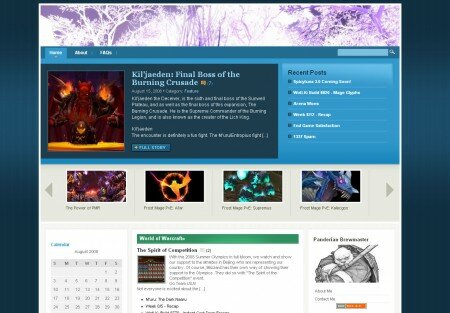
One of things I like most about the new design is the “Featured” section, and the “Carousel” thingy underneath of it. I also like the location of where the most recent posts are. You don’t have to scroll through the sidebars to find the list anymore.
With the “Featured” section, I can sticky posts which I think are important or feel needs to be read. It could be newest WotLK news, new Guides, or just maybe the newest post. It also has the look that kind of screams out, “Read me!”.
The “Carousel” section underneath of that, I can set to display all posts under a specific category. As you can see in the picture, I have set it to display all Frost Mage Guides, and you can use the arrows on the left or right to scroll through all the Guides that I have available.
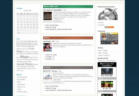
Another change that I’m excited about is the way Categories are handled. Instead of a sidebar listing the available categories in a hierarchical list, the main categories will be displayed in the middle of the site. This will make it easier to navigate through the site, and it makes the site look more “attractive”.
The latest post of that category will be displayed, and there will be a list of previous posts listed underneath. You can also click on the category, and it will display all posts which pertains to it. This will make things easier for you to find what you are looking for.
The three Main categories will be World of Warcraft, Anime, and Gaming (other than WoW). I will also have a category for Entertainment (movies, music, etc.) and one for Site Administration for news and updates on the site (like this post). The sidebars, I haven’t messed around with too much yet.
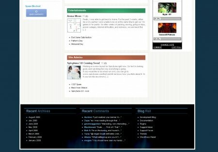
Instead of having the Archives and Recent Comments on the sidebar like my current design, I’ll put them in the footer to make the sidebars less cluttered. I haven’t decided if I will keep the Blog Roll on the bottom too yet. Maybe I’ll change it to display most Popular Posts or something.
There you have it. If all goes well, and I can get everything working the way I want, I’ll try to have it out by next month.
So what do you think about it so far? Anything I should add/remove/edit? I will appreciate any feedback, good or bad ![]()


 Subscribe to this author
I like it alot. Very slick design. Only part I’m not wild about is the BG vertical lines that fade as you scroll down. Any other pattern’s? Or perhaps just a subtle gradient?
Looks great! Looking forward to seeing it implemented! Though, I have to say, I like your current look too! The carousel is a really neat feature.
Seems like everyone’s on a re-vamping spree at the moment. Change is good, so yay you!
I really like the header (i’m guessing it’s from the WoW beta?) and looking forward to seeing the new design
Looks awesome, I love my theme but this made me think twice :O
Just a tiny note, I think you made a typo, “Panderian Brewmaster”
Thanks for the feedback guys!
@Aurdon
I didn’t even notice the vertical lines in the background until you pointed it out. I changed the gradient a bit, and it should look nicer now.
@Mae
I still like my current look too! I just couldn’t add some of the new features without breaking the current layout. There probably is a way- I just don’t enough css to do it though. Maybe I can find a way to preserve the current design too…
@Aendi
Yea the header used was from a WoW beta screenshot posted on MMO-Champion. It fit the design nicer than I thought.
@Horns
I was in a rush to copy some of the side bars to the new design. There are probably a lot more mistakes I made. Thanks for catching that one.